Showing posts with label design. Show all posts

Wednesday, 16 January 2013

eco design #8 [more water please]

via uc berkley

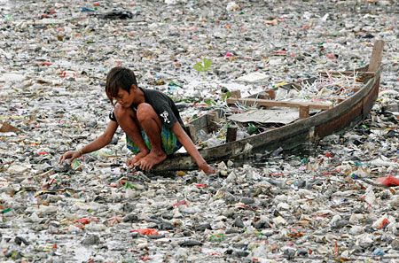
When we think about garbage, we think about plastic waste. We produce, as a world nation, about one hundred million tons of it every year! And a big part of it comes from water bottles.

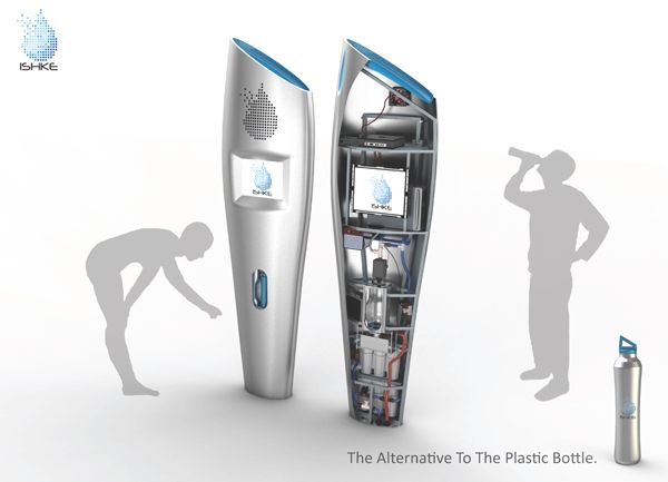
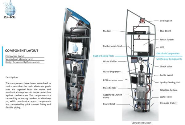
Jesse Leeworthy, a product designer, created a sustainable device, Ishke, that replaces plastic bottles with stainless ones. They also have RFID tags that permits cashless payments and to control the bottle specifications as well the user's preferences. For those who doesn't know what RFID means, here's a tip: Radio Frequency IDentification.
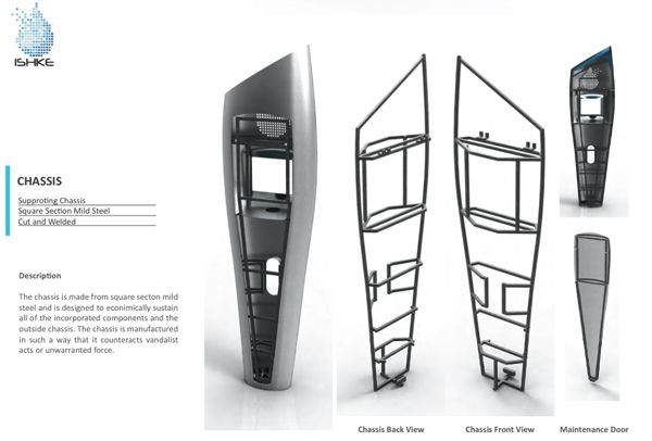
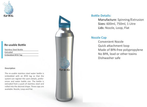


All images via yanko design.

It's worthy to check Jesse's website and look for his other products, like the sustainable light or the coffee trailer.

__


Wednesday, 31 October 2012

featuring #9 [mixology]

My dear dreamers,

I have a list for you. A list of articles and works that inspired me this week. I hope it will inspire you as well!

Stop Stealing Dreams by Seth Godin on Presentation Zen

Awesome Dribbble Designs That Got Rejected By Clients on Six Revisions

Time over Space by Jay Mark via FFFFound

Samhain on BBC

And Happy Halloween!

Monday, 23 April 2012

breathing #9 [earth day is everyday]

My dear dreamers,

Yesterday was the Earth day and I acted accordingly. I did not plant a tree as I wished but I turned this blog into a greener place (haha literally too!). I hope you'll like it and enjoy to spend here a little more of your time.

I'll explain you all the details of the logo and the colours I chose for the blog, as I want you to understand why it is the way it is. There will be some more things that will be changed as the RSS and the about designing dreams&me and Facebook page, for example. If you have any suggestions drop them on the comment's box. It will be much appreciated.

So... as you can see the logo is representing two leafs with the two D's together, one white and a gold one that is turning into green. The first leaf represents the perfection I want to achieve. And because...

White is a color, the perception of which is evoked by light that stimulates all three types of color sensitive cone cells in the human eye in nearly equal amounts and with high brightness compared to the surroundings. A white visual stimulation will be void of hue and grayness. Wikipedia
You know I love colours!

The second leaf is what will lead me to that goal. Memories are fine to remember and to learn with but we need to move on and do something with the day we have in hands. Gold turning into green is the representation of a new life, a new opportunity to turn yourself into a better you and gaining an award for each golden leaf you shifted from.

And...the background: black and green. Black gives us a negative feeling most of the times, but it's here to save power. Black doesn't need as much energy as the other colours as it is the absence of light. And green, well it's obvious, it represents nature, hope and this wonderful Universe we live on.

It's now time to be inspired by the wonders of nature, follow me into this whole new world < along with the soundtrack. (Click on the images to go to the source.)


Nature

Nature / Bokeh

Leaf Nature

Nature Macro Flower

Nature / Landscape / Mountains

Sea

Butterfly / Macro / Nature

I feel pretty, oh so pretty !!

tagetes

♥ The Drongo Love ♥ Happy Valentine's Day ♥

Nature (Conte - L'Arbre et le Soleil)

What did you do on the Earth day?


Saturday, 19 November 2011

let's play!

You like gaming, right? And if you're here I'm sure you like design either. So I'll list here some cool games graphic design related. Hope you enjoy them!

                                ♠ Kern Type by Marc MacKay (for Method of Action)

                                ♥ Munsell Hue Test by Color Munki

                                ♣ Logo Quiz by Yeah It Is

                                ♦  The Font Game by I Love Typography


Friday, 18 November 2011

I'm no queen

I'm reading another book of one of my favourite authors, Jostein Gaarder. The book is called The Solitaire Mystery. I'm loving the story so much that it did inspire me to do a post about one of the characters: the Joker.

A joker is a little fool who is different from everyone else. He's not a club, diamond, heart, or spade. He's not an eight or a nine, a king or a jack. He is an outsider. He is placed in the same pack as the other cards, but he doesn't belong there. Therefore, he can be removed without anybody missing him. (Jostein Gaarder, The Solitaire Mystery)

I feel a little bit like a Joker, as you see in my signature I'm not entirely a club and not completely an heart. I'm a mix of the two: creative and emotional and I'm always wondering about who I am and where this world comes from. A Joker isn't lonely, he enjoys life to the limit.

But enough talking. I have for you a little collection of Jokers I found on deviantArt:


Joker reloaded by ~Manarama on deviantART


RR PROJECT: 007 Black Joker by `ravenskar on deviantART


Augen Auf: Joker 1 by `yuumei on deviantART


Kennel Club - Joker by ~kenket on deviantART


Joker Card by *anry on deviantART


Which type of card are you?


Friday, 11 November 2011

inside is cozy

One of my favourite blogs about design, seesaw, is closing it's doors. I was sad at first, but then I get to know the personal blogs of each author. One that caught my attention was raneytown, by Raquel Raney.

Raneytown is filled with great art, full of inspiring posts and beauty all around. In one of it's posts I found another blog that I also want to share with you. Well, if you are an aficionado about interior design like me. It's name is Ema design blogg and it's now my top resource in what comes to interior design inspiration.

I'll feature some of the photos not yet presented on Raquel's post (I like her name a lot), because I'm not a copy/paste person and it will be just boring for you. Enjoy!


Photobucket
via  Ema design blogg 


Photobucket
via  Ema design blogg 


Photobucket
via  Ema design blogg 


Photobucket
via  Ema design blogg 


What's your favourite design interior blog?


Wednesday, 19 October 2011

just be inspired

I'm here to show some animations I watched lately (or maybe not). Enjoy them!


I've watched this a thousand times and I still laugh like the first one. Abbot and Costello are genius!


Another kinetic typographic work, now with my favourite quote form my favourite movie: The Devil's advocate and with my favourite actor: Al Pacino. I watched the movie more times that I'm willing to admit. 


Do you want to know what I love about kinetic typographic works? When they're well done they enhance the qualities of what they're quoting. It's a marvellous thing to watch.

See you soon!


Monday, 10 October 2011

My classic letter


Photobucket
Classic Letters by Nícia Cruz

Everyone likes sales and free stuff: brands and clients. There's no better way to promote your work than by offering your product/service for free.

If you're tired of the lame designs available in words' documents and want something more fancy yet formal, this pack is for you. You can choose between 6 different designs and even have access to the original file, so you can give wings to your creativity and change everything as you please. Just don't use it for commercial purposes. You can share alike, but please give me credit.

Hope you like it!


Creative Commons License
Classic Letters by Nícia Cruz is licensed under a Creative Commons Attribution-NonCommercial-ShareAlike 3.0 Unported License.

Thursday, 6 October 2011

Keep the apple alive


Photobucket
via Apple


Yesterday one of the most genius person in the world of today has passed away. He was an inspiration to a lot of people (and I'm sure that will remain in the future) and specially to design lovers. That way I couldn't help but to dedicate a post to Steve Jobs.

I know that the people who worked with him, or just followed his steps, will do their best to honor his memory and, that way, be inspiring people as well and create marvelous things for our delight.

And you, you can buy all his products to show your respect for his work or do something else. Something better. You can listen to his talks and do something with it. Get your hands dirt, your brain to hurt and do something good and beautiful for this world.

Keep the apple alive.
Photobucket

Monday, 26 September 2011

think of me

I keep my promises, even when they come a little bit late. I don't know if you remember this post, but I finally managed to do the typographic work I wanted. It took a while because I always seek perfection and things didn't come out the way I desired for some time.

Experience is the new thinking. Is that true for you?


experience is the new thinking by ~BlackLuna on deviantART
Hope you like and please tell me what you think.


Monday, 19 September 2011

It's ticking!

Time is what we have the least, even with 86.400 seconds every day. The clock never stops and we see our life going on and on without notice and we can do nothing about it. Who invented the time, anyway? Let's backpedal a little...

Our whole universe was in a hot dense state,
Then nearly fourteen billion years ago expansion started. Wait...
The Earth began to cool,
The autotrophs began to drool,
Neanderthals developed tools,
We built a wall (we built the pyramids),
Math, science, history, unraveling the mysteries,


That all started with the Big Bang! (I know you sang too!) Well, time, as space, started with that big ba-da-boom, but its measuring is Jost Burgi all to blame. He made the minute hand in 1577 but the standard time was only invented in 1878 by Sir Sanford Flemming. The in-betweens you'll have to read here, because what I have for you is even more amazing than that.

It's not a collection of my favorite watches, I'm afraid. I know you would love that; noted for another time, ok? Even greater than some cool watches is one big clock made in Japan (I swear to you, these one is even better that the Swiss watches we love). Carved with water and light, the train station of Osaka has the most amazing and beautiful watch I've ever seen. If you know the author, please let me know.


Have a nice day/night!


Friday, 1 July 2011

two dreams designed


My life is starting to change: I finished my graduation (didn't entered the Master,though) and this weekend I'm moving in to my new house. Regarding this, I also have "bad" news, I'll don't be able to post every week because I don't have Internet there, but in August that issue will probably be solved.

Meanwhile check Tereza's portfolio, I love her works:


Sad days by ~tereza-anton on deviantART


See you soon!

Wednesday, 29 June 2011

born this way

I'm a Light Sleeper
by nategonz, via flickr
Helvetica is the queen of typefaces: perfect in every way. She's dressed up for formal and informal occasions, for parties and funerals. It can appear in a love letter or in a sign next to you.

Arial is her rival: the fake and lousy imitation (redundant, I know). Only similar to Helv for the untrained eyes.

If you have Helvetica you don't need anything else, she's like the other side of your apricot (one of my favourite fruits, actually). That's why I did the work below:

Imperfection by ~BlackLuna on deviantART


Hope you've enjoyed! Oh! and if you're an Helvetica lover like me, you'll love these.


Monday, 30 May 2011

Back to the future

Hello sweeties!

Today I made another step toward my dream of working as a graphic designer. I applied for the Master in Graphic Design and Editorial Projects and I can't wait to get the response.

June, 15th will be a hell of a day or a paradise of a day (hopefully the second one): I'll receive the keys of my new home (yay!) and also the confirmation, or not (but that won't happen, right?), that I've entered the Master. It will be so awesome! Meeting new people, learning new things, starting new projects and developing skills... I would have so much to share with you!

But, for now I'll show you the work of a Bulgarian artist that I found recently. His name is Petya Savova, he's from Sofiya and he's a believer.


Don't forget to visit his portfolio. Enjoy!

Wednesday, 25 May 2011

Green CV

When you're a designer, or want to become one, you have to have not only a creative portfolio, but also a CV that will stand out from the crowd. And I'm not meaning information only, but also the layout.

The most part of us, when writing a resume, think of impressive data. What we want to say is that we're better than the other applicants. But why saying when you can show it? We all know how to write and sometimes we doesn't say all the truth, and let's face it, they know that too. But actually do what we say we know how to do... it's a bit more difficult, right?

It will take time and sometimes can be frustrating, there's so much information you want to put down... Just make it simple: less is more so put only the really important data. And don't forget to make your contact visible, or else, no matter how much they liked you, they'll could never reach you.

There is some outstanding examples that I want to show you and in the end I'll present to you my own creative CV, it isn't as good as the others, but hey! Everything I learned is self-taught!

You can see them on two great websites: hongkiat and in save delete, they already did the hard-work for me so let's enjoy it!

Mine is right here, I'll only show you a print-screen, but I'll upload it at my behance and deviantart portfolios.

Photobucket

Photobucket


Tuesday, 17 May 2011

Acid work

Do you remember sweet? 3 months passed since then, but I didn't forgot my project of creating a series of flavours. Today I present you Acid, among other two works I did this week.


One of them is Synaesthesia. I think I never told you about this neuropathology before, but I've been obsessed by this for the last 3 years because it's such a different way to see the world. It seems a good disease to me (if that exists) because we can relate it to design and creativity. My master's thesis will focus on this for sure.

Synaesthesia can be explain as a mix of senses ( a linkage really), in a sort of way. We use just the eyes to see, only the ears to hear, and the hands to touch, and so on. But people with this pathology can use eyes to hear or ears to see. They associate colours to letters and numbers, or even music notes! That doesn't sound amazing?

We use synaesthesia very often in our lives too, specially when we write. When you say 'what a sweet sound' or 'I'm feeling blue' you're being synaesthetic.


The last one is about my love about design.


I hope you've enjoyed them!

P.S Some of these works are available for print on DeviantArt.

Sunday, 24 April 2011

Bunny times

Florbela Espanca, via barcos em temporais

Maybe you don't know Florbela Espanca. She was one of the greatest female poets of all times. A friend of mine called her the Queen of Sonnets and that's so true.

One day she wrote: "Não costumo acreditar muito nos sonhos... porque de todos se acorda". In English is something like this: "I usually don't believe much in dreams... because from them all we wake up". Sometimes we have day dreams, some look very real, but in the end they're nothing. But who doesn't like to dream?

I'm saying all this because the news I was going to share with you no longer exists. It's not a good news, but I think isn't too bad either.

I can't give you sweet almonds or yummy chocolate eggs, but i can send you a hug and wish you a delicious Easter and promise you that designing dreams will return to its regular posts. Yay!

Photobucket


Friday, 1 April 2011

1st!

Photobucket
via we heart it

First of April came with a lot of sunshine, so I have much to celebrate today (plus is my dad's b-day and me&my bf are celebrating 84 months! Yay!).

Today I want to share with you some of the best posts I came across with along this week. Let's make a list, because I love'em.


Hope you've liked it!

Link Within

Related Posts Plugin for WordPress, Blogger...