The most part of us, when writing a resume, think of impressive data. What we want to say is that we're better than the other applicants. But why saying when you can show it? We all know how to write and sometimes we doesn't say all the truth, and let's face it, they know that too. But actually do what we say we know how to do... it's a bit more difficult, right?
It will take time and sometimes can be frustrating, there's so much information you want to put down... Just make it simple: less is more so put only the really important data. And don't forget to make your contact visible, or else, no matter how much they liked you, they'll could never reach you.
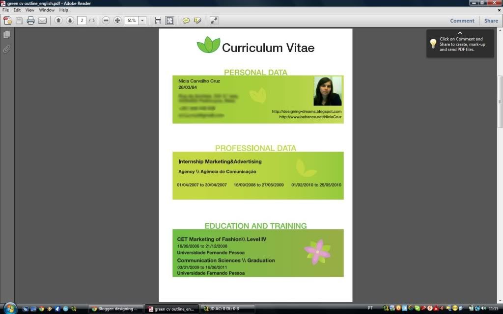
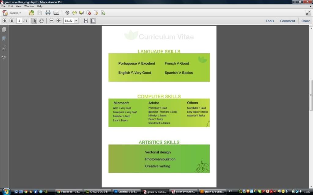
There is some outstanding examples that I want to show you and in the end I'll present to you my own creative CV, it isn't as good as the others, but hey! Everything I learned is self-taught!
You can see them on two great websites: hongkiat and in save delete, they already did the hard-work for me so let's enjoy it!
Mine is right here, I'll only show you a print-screen, but I'll upload it at my behance and deviantart portfolios.


No comments:
Post a Comment